








Wedding Fonts: How to Choose the Perfect Typography for Your Indiian Wedding
Introduction:
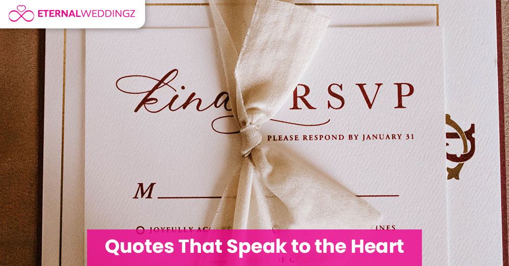
Wedding fonts for Indian weddings can look like a tiny design decision until you actually have to choose them. You have booked the venue, locked the caterer, found the lehenga of your dreams, and approved the invitation design. Then someone asks, “Which font should we use?” and suddenly you are staring at 400 options wondering how the alphabet got so complicated. Fonts can tie an invitation together or leave it feeling cluttered and difficult to read. They also set the tone before your guests have processed a single word. Think of fonts as the outfit your words wear to the wedding. You would not send your invitation in pyjamas, right?
And because an Indian wedding usually has several events leading up to the main celebration, you want the stationery to feel visually consistent without every card looking exactly the same. The right font system helps you do that.
Why Fonts Matter More Than You Think
A wedding invitation has two jobs: it has to feel like your celebration, and it has to tell people where to be and when. Typography affects both. A beautiful script can make your names feel special, but the same script used for timings, addresses, and RSVP details can turn a simple card into a reading test. The best wedding stationery usually creates a clear hierarchy. One font gets attention, another carries the details, and every choice feels connected to the mood of the wedding. That is what makes a suite feel polished instead of busy.
Types of Fonts for an Indian Wedding
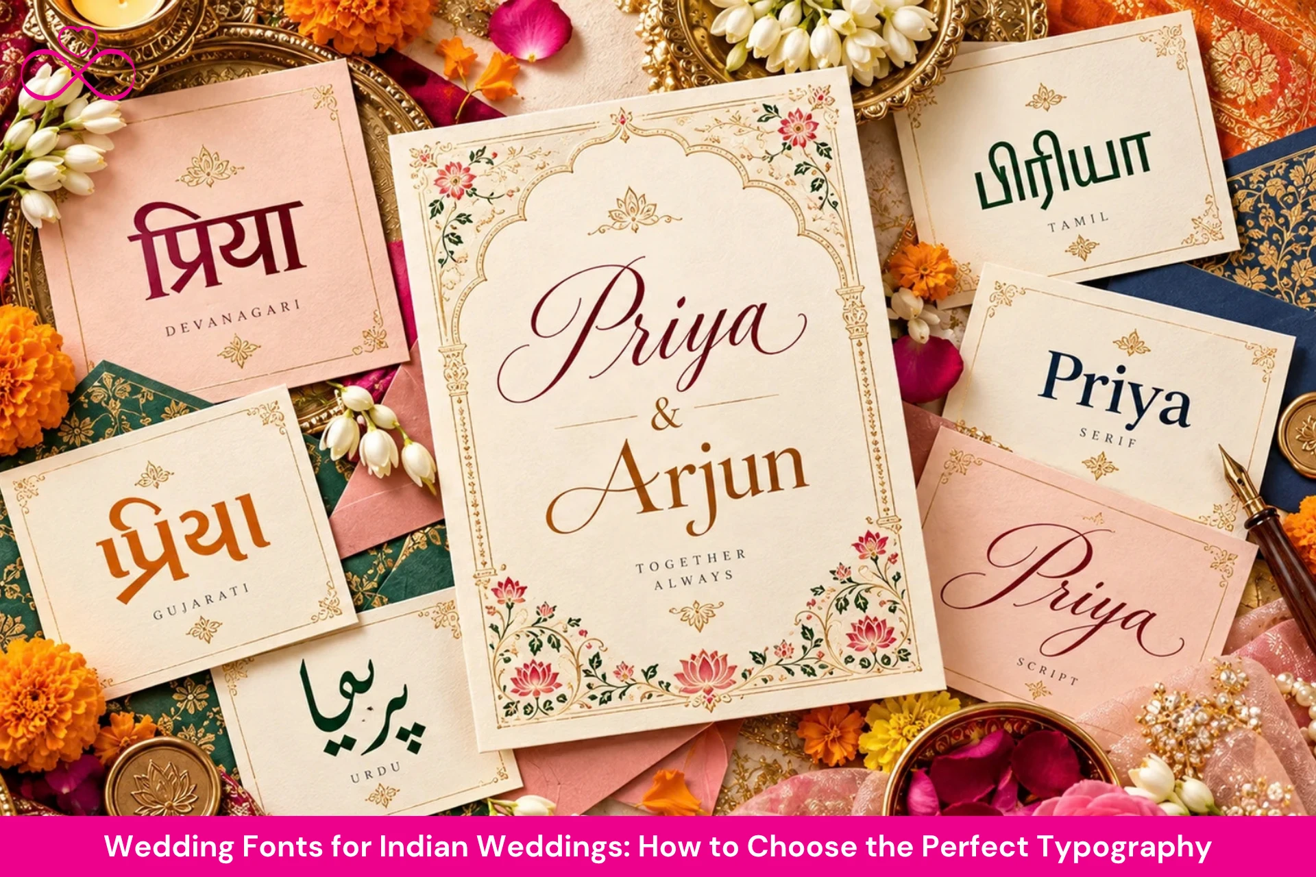
Most wedding stationery uses three broad font families. Script fonts look handwritten or calligraphic and work best for names and short headings. Serif fonts have small finishing strokes on the letters and usually feel classic, editorial, or formal. Sans-serif fonts are cleaner and simpler, which makes them useful for timings, addresses, menus, and modern wedding designs.
For bilingual or regional-language stationery, you also need a font that properly supports the script you are using. A good English pairing means very little if the Hindi, Marathi, Gujarati, Tamil, Telugu, or Bengali text renders badly beside it.
Best Fonts for English Text
All the fonts below are available on Google Fonts, so they are free and easy to use for both digital and print stationery.
For Names and Headlines: Script Fonts
- Great Vibes: Graceful and formal, like calligraphy on a palace invitation.
- Allura: Soft and flowing, great for a delicate, feminine look.
- Pinyon Script: Traditional and ornate, ideal for grand royal-style weddings.
- Parisienne: Playful but polished, good if you want romance without too much formality.
- Dancing Script: Casual and lively, a good pick for haldi, mehendi, or sangeet invites.
For Body Text: Serif Fonts
- Playfair Display: High-contrast and luxurious, a favourite for elegant invitations.
- Cormorant Garamond: Light, refined, and editorial, beautiful for heritage and palace weddings.
- Cinzel: Inspired by classical Roman lettering, with a regal, carved-in-stone feel.
- Libre Baskerville: Easy to read and quietly classy.
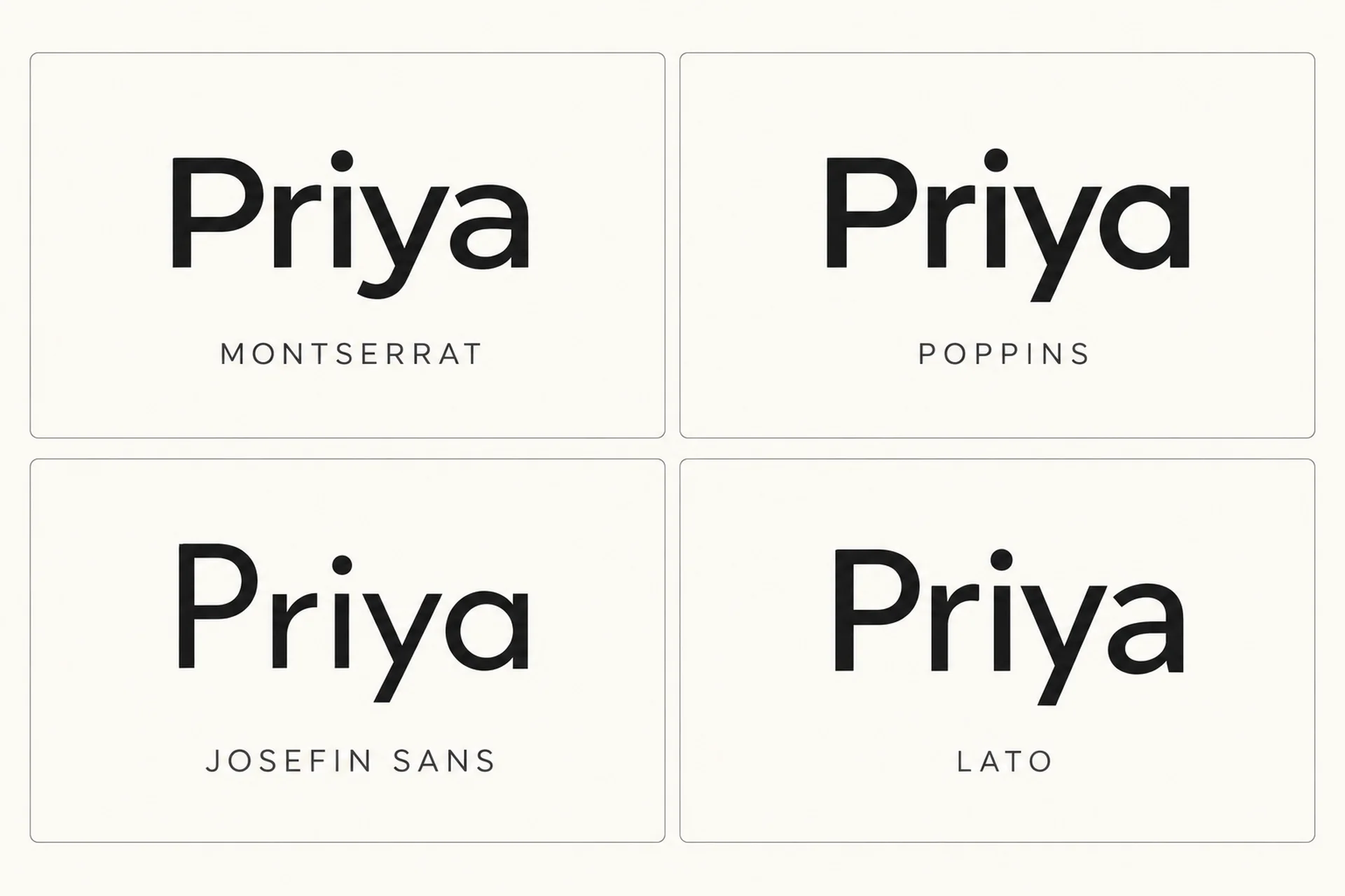
For Details: Sans-Serif Fonts
- Montserrat: Clean and versatile. It works almost anywhere.
- Poppins: Friendly and modern, with a round, youthful look.
- Josefin Sans: Slim and stylish, great for a minimalist or boho wedding.
- Lato: Neutral and readable, the reliable cousin who always shows up on time.
[Source - Image Generated By AI]
Best Fonts for Hindi, Marathi, Gujarati and Other Languages
This is where many couples get stuck. A lot of beautiful English fonts simply do not support Indian scripts, so you cannot type in Devanagari and hope for the best. A poor font can mishandle matras or conjunct letters, which is the last thing you want in your parents' names or a wedding mantra.
Devanagari: Hindi, Marathi and Sanskrit
- Tiro Devanagari Hindi: An elegant serif style that pairs well with classic English serifs.
- Yatra One: Bold and decorative with a traditional flavour, great for headings such as “शुभ विवाह”.
- Kalam: Handwritten and warm, perfect for casual events and personal touches.
- Amita: Calligraphic and graceful, suited to formal invitations.
- Mukta and Hind: Clean and readable, safe choices for body text and details.
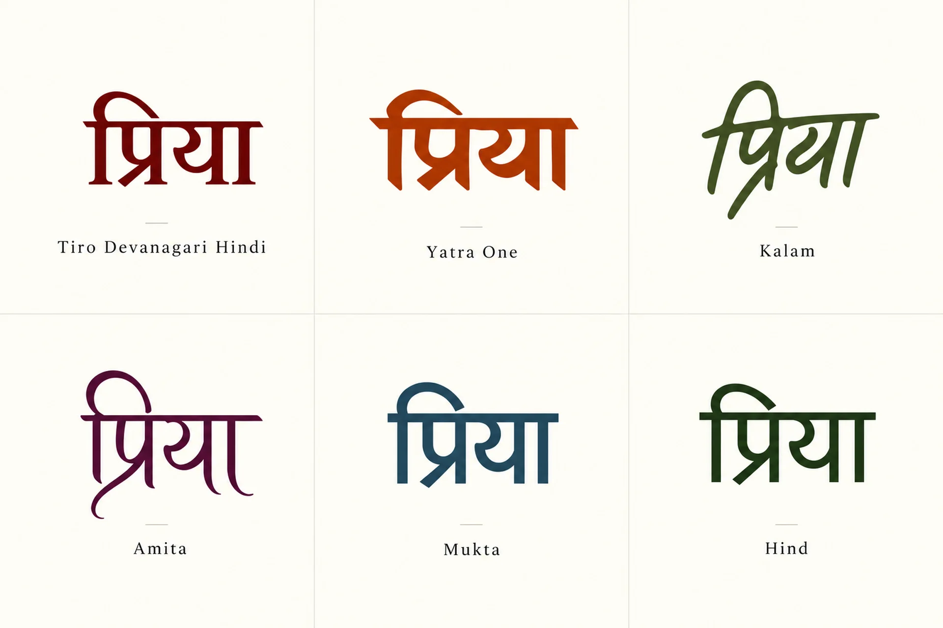
[Source - Image Generated By AI]
Gujarati
- Shrikhand: A chunky, festive display font that supports both Gujarati and Latin, great for garba and sangeet nights.
- Hind Vadodara and Mukta Vaani: Neat and readable for the main details.
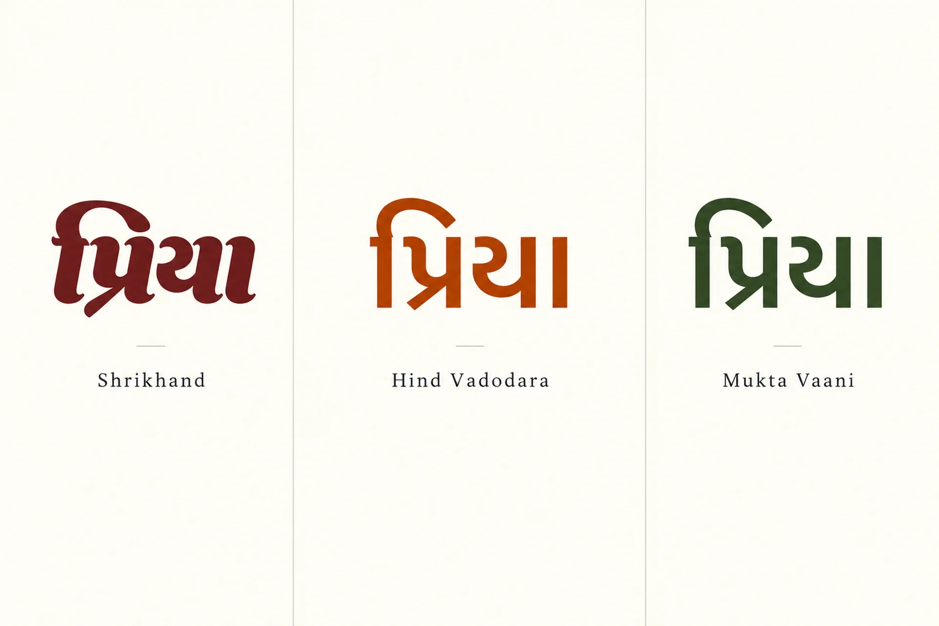
[Source - Image Generated By AI]
Tamil, Telugu, Bengali and Other Scripts
Catamaran for Tamil and Hind Siliguri for Bengali are reliable, easy-to-read options. Whatever language you use, test the full invitation text before you lock the design.
[Source - Image Generated By AI]
A small tip from us: always test every name, matra, and conjunct letter in the final font before sending anything to print. A beautiful font that mangles “श्रीमती” is not worth it.
Pairing Fonts Like a Pro
A good pairing gives each font a job. One can carry the personality, while the other keeps the practical information easy to read. Here are combinations that work well for common Indian wedding styles.
1. Royal Rajasthani Palace Wedding
Pinyon Script for names + Cormorant Garamond for details + Tiro Devanagari Hindi for Hindi text. Regal and rich, especially when printed in gold on deep maroon or navy.
2. Traditional South Indian Wedding
Playfair Display for headings + Lato for details + Catamaran for Tamil text. Dignified and clear, and lovely on cream paper with temple-inspired borders.
3. Modern Minimalist Wedding
Josefin Sans for headings + Montserrat for details + Mukta for Hindi text. Clean, airy, and easy to carry across digital and printed stationery.
4. Fun Sangeet or Haldi Invite
Dancing Script or Shrikhand for headings + Poppins for details + Kalam for Hindi text. Colourful, cheerful, and ready to dance.
5. Beach or Destination Wedding
Parisienne for names + Josefin Sans for details. Breezy and relaxed, with no heavy ornamentation needed.
Where to Use Which Font
Your wedding has more surfaces for lettering than you might think. The font that looks perfect on an invitation may not work on a seating chart that guests need to read from three metres away.
1. Wedding Invitations: Print and Digital
This is the main event. Use a script or ornate serif for the names, and a simple sans-serif or serif for the date, time, and venue. For WhatsApp invitations, remember that guests will read them on small phone screens, so go bigger and bolder than you would on paper.
2. Welcome Signage and Seating Charts
Guests read these from a distance and often in a crowd. Use clear, high-contrast fonts. Save the fancy script for the welcome headline and keep names, table numbers, and directions in something easy to read.
3. Wedding Favours and Thank-You Cards
This is where you can get personal. A handwritten-style font adds warmth and can make the gift or note feel more thoughtful.
4. Wedding Website or E-Invite Page
Stick to two fonts at most, and make sure they are web-safe or properly embedded so they look consistent across devices.
Font Mistakes to Avoid
Even beautiful stationery can be let down by poor lettering choices. These are the mistakes we would avoid before anything goes to print.
1. Using Too Many Fonts
Three fonts is the maximum. Five fonts on one card is not creative; it is chaos. A wedding invitation should not look like a ransom note.
2. Writing Everything in Script
Script fonts are gorgeous in small doses and exhausting in paragraphs. Never set long text, especially not all caps, in a script. It becomes difficult to read very quickly.
3. Ignoring Contrast
Gold text on a cream background looks beautiful in your imagination and can disappear in real life. Check that the text colour stands out clearly from the background, especially for small details such as timings.
4. Choosing Tiny Text
Remember, the guest list includes your dadi, your nani, and your chacha who refuses to wear his glasses. Keep important details at a comfortable size.
5. Forgetting to Check Language Support
A font that looks perfect in English may break in Hindi, Marathi, or another Indian script. Always preview the actual text first.
6. Skipping the Print Test
Screens lie. Colours, hairline strokes, and small details can look different on paper. Ask your printer for a sample before you order 500 cards.
7. Mismatching the Font with the Theme
A comic-style font on a royal palace wedding invitation? Please, no. Let the typography support the mood of the celebration rather than fight it.
Picking Your Perfect Font
Still cannot decide? Use this quick method before you send the final artwork to your designer or printer.
Step 1: Define Your Wedding Vibe
Is it royal, rustic, modern, beachy, or traditional? Write down three words that describe your wedding. Your font should feel like those words.
Step 2: Shortlist Two or Three Options
Preview your names, date, and venue in each option. Judge how your actual text looks, not how good the sample alphabet looked on the font page.
Step 3: Test for Readability
Show the draft to a friend or family member for five seconds. Can they tell you the date and venue? If yes, you are on the right track.
Step 4: Stay Consistent
Use the same font family across your invitation, signage, menu, and social media. It makes the wedding feel polished and thought-through, almost like it has its own visual identity.
Your Happily Ever After Starts With the Perfect Letter
The right font won't make your wedding, but it will elevate every card, board, and screen your guests see. Pick something that feels like you, keep it readable, and let your love story do the talking. Need help finding the perfect venue, decorators, or planners to bring your wedding theme to life? Eternal Weddingz has your back. We'll help you find trusted vendors who understand that every detail, even the font, matters.